ABM Orthodontics
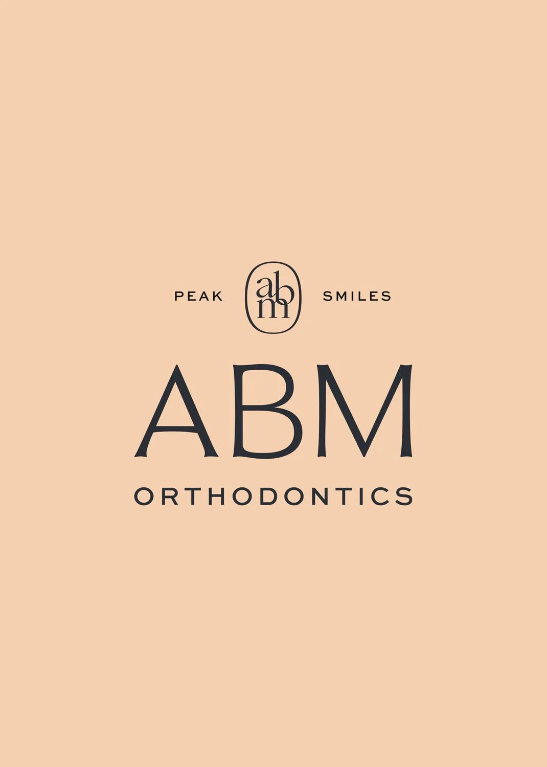
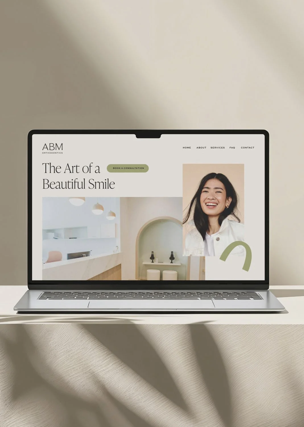
ABM Orthodontics approached us as a startup preparing to launch with a brand that would immediately stand apart in a crowded market. The competitive landscape was filled with nearly identical identities - clinical, traditional, and visually indistinguishable from one another. Together, we saw an opportunity to create something more human, more welcoming, and more reflective of an elevated patient experience.
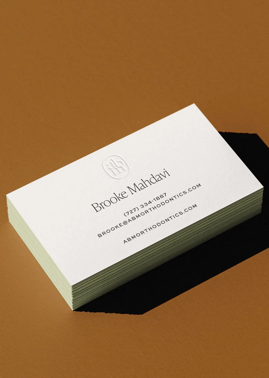
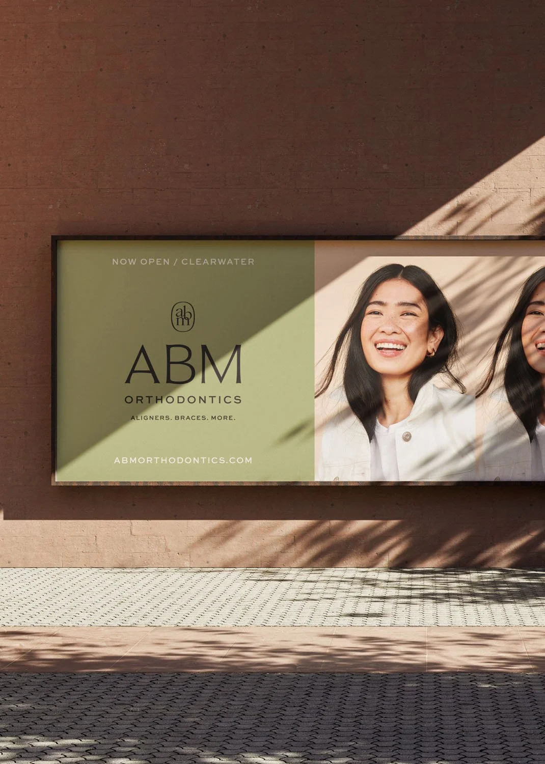
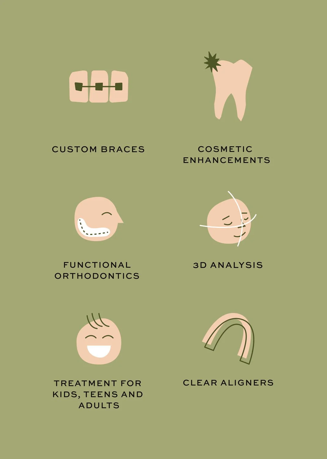
We developed a warm, earthy palette paired with abstract illustration and authentic, natural smiles to signal a departure from the typical “medical” aesthetic. The goal was to communicate care that feels personal, attentive, and elevated, an experience designed around the patient. Every element was crafted to reassure prospective patients that they would be seen, heard, and genuinely cared for.
This project was especially rewarding as a designer, because it pushed beyond industry conventions. By breaking out of the expected visual mold, we created a distinctive identity that feels both approachable and sophisticated, proof that healthcare brands can be professional without feeling impersonal.
OVERVIEW
SERVICES
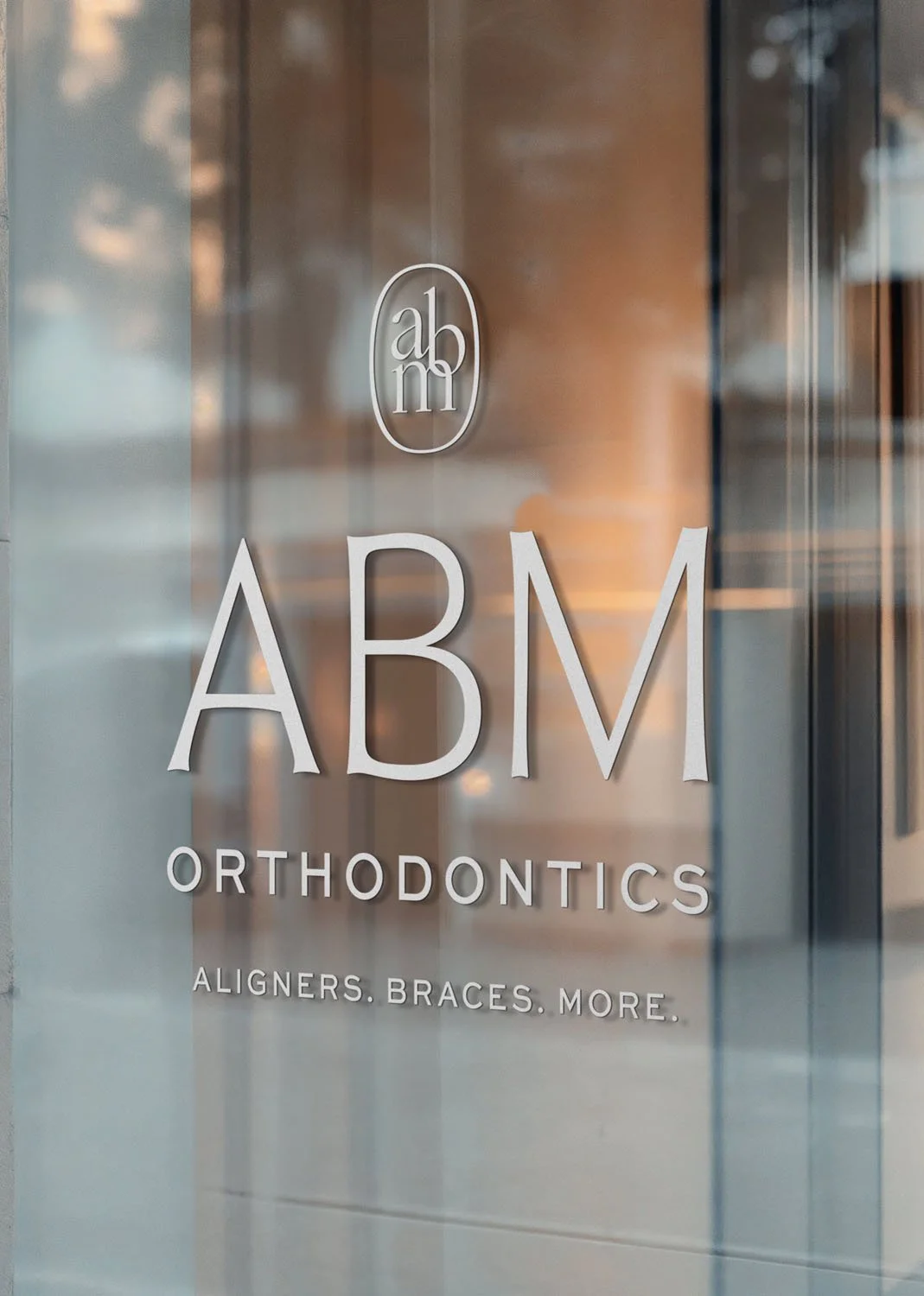
Brand Identity
Custom Illustrations
LOCATION
Clearwater, FL
Brand Designer
@Bridge + Bloom
ROLE